James Hunt
Candidate Number: 4462
Centre no. 51319
Saturday, 2 April 2011
Friday, 1 April 2011
What have you learned from your audience feedback?
 Click the image for a clearer shot of the audience feedback from Facebook. The one's from youtube are from the final version of the video.
Thursday, 31 March 2011
My Digi-Pak

This is my final version of my digi-pak starting with my front cover. I decided to use the picture of the band leaning against a brick wall a similar picture which is on the poster however the cd cover is a side on shot. The font I decided to use was Dock 11 which is downloadable from dafont.com. I like the boldness of this font and the way you can only use capital letters in the font adds to this. I decided to use the colour yellow for the font because it would create a contrast with the other colours used (black, white, and blue). Also I decided to use a small border around the band name, to continue with the colour scheme I decided that the border colour should be blue also. The font I used for the title of the song "Mr.Brightside" I decided to use the font Chiller as it creates a "drawn on" look and I also decided to use another slight border around each letter. I again used blue and white to continue with the colour scheme/ house style again as well as to create a contrast between the title and the black background behind it. The complete black background is due to cutting out grass and the rest of the shot as this would give it a home made unprofessional look. I then decided to "extend" the pathway by copying part of it, enlarging it and then positioning it to look like it is part of the path. I also used neon glow on the photo to give it a black and white effect with a blue "neon" glow around the outside. 
A screenshot after editing out the background grass and adding neon glow. 

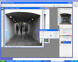
This is the final version of the back cover of the digi-pak. I decided to go for a shot of the band members walking through the tunnel that was used in the music video. To contunue with the urban house style. I decided to list the tracks on the left wall of the tunnel and to give it a sort of "Graffiti" look. I again used the same font from the front cover "Dock 11". As i believed this was the most suitable font to use and that I did not use too many fonts in the digi-pak. On the other wall I took a screenshot of the main characters from the storyline in the video and gave it a painted effect. I also downloaded a barcode font to create the bar code in the bottom right corner, after I had created a white square in that position. I then made my own fictional record company and logo at the bottom of my cover. Based on the research that many back covers of singles and albums have their record company and print written on the back. The photograph was another taken from the photoshoot, after it had been cropped down and brightness and contrast adjusted to -67 for brightness and + 77 for the contrast.

Wednesday, 30 March 2011
Final version of Magazine A4 poster
 This is the final version of my A4 magazine poster. I decided to use the same font for both the band name and title of song on the CD cover and the poster. I went along with usual convetions by having the band name at the top of the poster and the title and release date at the bottom of it. I decided to use the colours blue and yellow for the fonts as they are easy to read against the photograph back ground and manage to contrast well. I wanted to represent the band in a teenage, indie/rock way. I decided to use the location of suburban area to add to the representation
  This is the original photo I used from the photoshoot of the members of the band leaning against a brick wall in a urban area and surroundings. To get it to fit down onto the poster I cropped the image centrally and made it more portrait rather than landscape. I then decided that I wanted to give the image an animated effect to it.
 Firstly I made a duplicate layer and went to filter- artistic- cut out and set the number of levels to 8, edge simplicity 5 and edge fidelity to 3. As shown in the print screen opposite. After that I set the mode of this layer to lumonosty. I then dulpicated this layer and named it "half tone" - then I went to filter - pixelate - colour halftone to a maximum radius of 4 and set the mode of the layer to "colour". In a new layer from background I went to filter - other - high pass and set it to 4.4 pixels.
 To finish I went to image - adjustment -threshold and set it to 123 give the animated cartoon effect.
Tuesday, 22 March 2011
Evaluation Questions - In what ways does your media product use, develop or challenge forms and conventions of real media products?
In what ways does your media product use, develop or challenge forms and conventions of real media products? There were many different conventions to take into account of when I created my music video. Having carried out research into music videos of the genre rock and indie. I also studied videos of The Killers to see the conventions that they follow or break in their music videos. In many rock music videos a usual convention is to show a lot of footage of guitars. I decided to use this convention in my production by using various amounts of close ups of two guitars. This helps to fully establish with the audience that the video is stereotypically of the rock genre. Another way of developing a convention in real media products is having a band playing and a storyline running with it through out the music video, which is incredibly common in approximately 70% of music videos in my opinion. I developed this convention by deciding to film two different parts of the video: one with a band playing on a small stage with all the necessary equipment. The second part of the video using a storyline of the female in a couple cheating. Before filming started, I decided to keep the story and band as close to the original storyboard as possible. Which guided me as to what conventions I should use in the music video.
Another common convention in real music videos that I used was the use of lip syncing and having the band in sync with the music also. Which gives the impression that they are playing in just one performance and a professional edge to the music video from one main conventions.
From my study of Professional music videos I found out have a variety of different camera angles and quick cuts. So I decided to incorporate this convention into my own music video. I decided to use many different camera angles such as close ups, establishing shots in both the band scenes and storyline scenes. This again gave the production a professional look to it.
Other conventions in my music video that i decided to use, is that I would have one main singer so only one person would need to lip sync which is another common convention i used. Conventions I challenged were having a title at the start of the music videos (which is used used in a few music videos), i believed that it would not fit in to the style of the video and that it would make the video look unprofessional as well.
Subscribe to:
Posts (Atom)