
This is the final version of my A4 magazine poster. I decided to use the same font for both the band name and title of song on the CD cover and the poster. I went along with usual convetions by having the band name at the top of the poster and the title and release date at the bottom of it. I decided to use the colours blue and yellow for the fonts as they are easy to read against the photograph back ground and manage to contrast well. I wanted to represent the band in a teenage, indie/rock way. I decided to use the location of suburban area to add to the representation

This is the original photo I used from the photoshoot of the members of the band leaning against a brick wall in a urban area and surroundings. To get it to fit down onto the poster I cropped the image centrally and made it more portrait rather than landscape. I then decided that I wanted to give the image an animated effect to it.

Firstly I made a duplicate layer and went to filter- artistic- cut out and set the number of levels to 8, edge simplicity 5 and edge fidelity to 3. As shown in the print screen opposite. After that I set the mode of this layer to lumonosty. I then dulpicated this layer and named it "half tone" - then I went to filter - pixelate - colour halftone to a maximum radius of 4 and set the mode of the layer to "colour". In a new layer from background I went to filter - other - high pass and set it to 4.4 pixels.

To finish I went to image - adjustment -threshold and set it to 123 give the animated cartoon effect.
 This is the final version of my A4 magazine poster. I decided to use the same font for both the band name and title of song on the CD cover and the poster. I went along with usual convetions by having the band name at the top of the poster and the title and release date at the bottom of it. I decided to use the colours blue and yellow for the fonts as they are easy to read against the photograph back ground and manage to contrast well. I wanted to represent the band in a teenage, indie/rock way. I decided to use the location of suburban area to add to the representation
  Firstly I made a duplicate layer and went to filter- artistic- cut out and set the number of levels to 8, edge simplicity 5 and edge fidelity to 3. As shown in the print screen opposite. After that I set the mode of this layer to lumonosty. I then dulpicated this layer and named it "half tone" - then I went to filter - pixelate - colour halftone to a maximum radius of 4 and set the mode of the layer to "colour". In a new layer from background I went to filter - other - high pass and set it to 4.4 pixels.
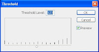
 To finish I went to image - adjustment -threshold and set it to 123 give the animated cartoon effect.
No comments:
Post a Comment