Thursday, 31 March 2011

My Digi-Pak


This is my final version of my digi-pak starting with my front cover. I decided to use the picture of the band leaning against a brick wall a similar picture which is on the poster however the cd cover is a side on shot. The font I decided to use was Dock 11 which is downloadable from dafont.com. I like the boldness of this font and the way you can only use capital letters in the font adds to this. I decided to use the colour yellow for the font because it would create a contrast with the other colours used (black, white, and blue). Also I decided to use a small border around the band name, to continue with the colour scheme I decided that the border colour should be blue also. The font I used for the title of the song "Mr.Brightside" I decided to use the font Chiller as it creates a "drawn on" look and I also decided to use another slight border around each letter. I again used blue and white to continue with the colour scheme/ house style again as well as to create a contrast between the title and the black background behind it. The complete black background is due to cutting out grass and the rest of the shot as this would give it a home made unprofessional look. I then decided to "extend" the pathway by copying part of it, enlarging it and then positioning it to look like it is part of the path. I also used neon glow on the photo to give it a black and white effect with a blue "neon" glow around the outside.

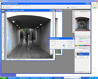
A screenshot after editing out the background grass and adding neon glow.

This is the final version of the back cover of the digi-pak. I decided to go for a shot of the band members walking through the tunnel that was used in the music video. To contunue with the urban house style. I decided to list the tracks on the left wall of the tunnel and to give it a sort of "Graffiti" look. I again used the same font from the front cover "Dock 11". As i believed this was the most suitable font to use and that I did not use too many fonts in the digi-pak. On the other wall I took a screenshot of the main characters from the storyline in the video and gave it a painted effect. I also downloaded a barcode font to create the bar code in the bottom right corner, after I had created a white square in that position. I then made my own fictional record company and logo at the bottom of my cover. Based on the research that many back covers of singles and albums have their record company and print written on the back. The photograph was another taken from the photoshoot, after it had been cropped down and brightness and contrast adjusted to -67 for brightness and + 77 for the contrast.

Wednesday, 30 March 2011

Final version of Magazine A4 poster

This is the final version of my A4 magazine poster. I decided to use the same font for both the band name and title of song on the CD cover and the poster. I went along with usual convetions by having the band name at the top of the poster and the title and release date at the bottom of it. I decided to use the colours blue and yellow for the fonts as they are easy to read against the photograph back ground and manage to contrast well. I wanted to represent the band in a teenage, indie/rock way. I decided to use the location of suburban area to add to the representation This is the original photo I used from the photoshoot of the members of the band leaning against a brick wall in a urban area and surroundings. To get it to fit down onto the poster I cropped the image centrally and made it more portrait rather than landscape. I then decided that I wanted to give the image an animated effect to it. Firstly I made a duplicate layer and went to filter- artistic- cut out and set the number of levels to 8, edge simplicity 5 and edge fidelity to 3. As shown in the print screen opposite. After that I set the mode of this layer to lumonosty. I then dulpicated this layer and named it "half tone" - then I went to filter - pixelate - colour halftone to a maximum radius of 4 and set the mode of the layer to "colour". In a new layer from background I went to filter - other - high pass and set it to 4.4 pixels. To finish I went to image - adjustment -threshold and set it to 123 give the animated cartoon effect.

Tuesday, 22 March 2011

Evaluation Questions - In what ways does your media product use, develop or challenge forms and conventions of real media products?

In what ways does your media product use, develop or challenge forms and conventions of real media products? There were many different conventions to take into account of when I created my music video. Having carried out research into music videos of the genre rock and indie. I also studied videos of The Killers to see the conventions that they follow or break in their music videos. In many rock music videos a usual convention is to show a lot of footage of guitars. I decided to use this convention in my production by using various amounts of close ups of two guitars. This helps to fully establish with the audience that the video is stereotypically of the rock genre. Another way of developing a convention in real media products is having a band playing and a storyline running with it through out the music video, which is incredibly common in approximately 70% of music videos in my opinion. I developed this convention by deciding to film two different parts of the video: one with a band playing on a small stage with all the necessary equipment. The second part of the video using a storyline of the female in a couple cheating. Before filming started, I decided to keep the story and band as close to the original storyboard as possible. Which guided me as to what conventions I should use in the music video.
Another common convention in real music videos that I used was the use of lip syncing and having the band in sync with the music also. Which gives the impression that they are playing in just one performance and a professional edge to the music video from one main conventions.

From my study of Professional music videos I found out have a variety of different camera angles and quick cuts. So I decided to incorporate this convention into my own music video. I decided to use many different camera angles such as close ups, establishing shots in both the band scenes and storyline scenes. This again gave the production a professional look to it.


Other conventions in my music video that i decided to use, is that I would have one main singer so only one person would need to lip sync which is another common convention i used. Conventions I challenged were having a title at the start of the music videos (which is used used in a few music videos), i believed that it would not fit in to the style of the video and that it would make the video look unprofessional as well.

Friday, 18 March 2011

Font Testing

These are the fonts that I shortlisted for the band logo of The Killers. I narrowed it down between Sam's town and Dock 11. Moreover I decided that the Sam's Town is based on The Killers current logo and I wanted to have a new one for my project so I decided to opt for Dock 11.

Magazine A4 advertisement (first draft)


I created this advert using photoshop. I decided to give the photo a comic/cartoon look to it while keeping the band logo the same. The advertisement is designed to suit a A4 page in a magazine.
I decided to use a photo from the photoshoot of the band. The photo shows the four band members in an urban area, leaning against a brick wall and standing on a bricked pathway/ pavement.

After creating this i decided that I should use the same font for the band name that I used on the digi-pak. I also decided that I would be advertising a single rather than a album.

Digi-Pak and Magazine Advertisement Research


This CD cover shows the four band members of The Killers looking directly at the camera in a black and white shot with a beige effect. This really makes the black on the band logo and their figures stand out against the white/beige background which looks like a wall. Creating a contrast between the band members and the rest of the shot. Also 3 of the 4 band members have facial hair this also stands out more due to the fact of the house style and selected colour scheme of the album. The two members in the middle are wearing sunglasses which are also black that creates a contrast with the background again. The photo is very simplistic with what looks like just two layers background and foreground (the band). I also notice that none of them have their instruments with them. This shows that from the album cover people do not look for instruments and that having instruments shown on a cd cover may be deemed insignificant as the main goal for a cd cover is to stand out. This Cd cover continues conventions of having all the band members on the front and having the band name/logo at the top of the cover in a central position.


The back cover continues with the black and white house style with track numbers written in the primary colour red, this again distinguishes the font from the all black background behind the text. The rest of the text is written in a Serif font which creates a respectable representation of the band. The photo is similar to the front cover. A closer shot of the band members against the wall but still in black and white. The bar code is located at the bottom right with text about the companies above. This is in a normal sans serif font and a very plain white bar as a background. The band logo in black is used again down the sleeves of the cover. The back cover similarly like the front is very simplistic. It does not have too much information on it or too many pictures. Simpleness of the cover makes it very effective and helps differentiate the cover from other cd covers.


This is a magazine advertisement poster for Kasabian’s single “shoot the runner”. The most noticeable thing about this poster is the bright colours used in the abstract artwork of the band performing. The black background against the bright colours makes it very eye-catching. The same capital, serif font is used through out apart from the band logo and NME logo. The text is spread out evenly in the centre of the poster which is a convention that most posters in general tend to use. The use of the red text for the quote and rating from NME, contrasts with the black making it very easy to read. Also the quote is small which can be read easily. The band’s bright colours give the representation that they are very lively when they perform. They member situated at the top of the page is posing with his hand pointing like a gun being shot, with a white splatter next to it. This gives the effect that it has been painted and is a piece of art. The copyright details conventionally are positioned at the bottom and is also written in capitals which still brings attention to it, despite its position.

Thursday, 17 March 2011

The FINAL Version of my Music Video Production


The software I used to edit this was Nero Vision Express. This decision was based on my past experience with this software that I have created videos for youtube with. It has a suitable amount of effects and filters to use at my disposal.I had to use many different props for the music video including: Drums, Amps, Microphone, Guitars, Stage, mobile phone, car and many many more.

As some people pulled out just before the arranged date for the filming of the band scenes.We had to improvise quickly.This ended up with my self taking the part as the lead singer. My colleagues who decided to assist me with this part supported me to take up the role. This meant that I needed to find a camera man for the band scene which has had experience with video camera and photography before, which I managed to.

The band I believed should go for a underground indie, teenage look. This was fulfilled by wearing dark colours and using the same colours for props. Both guitars were black as I thought that it would add to the presentation we were trying to show. I also thought that by giving one of the guitarists a pink guitar strap, this would create a contrast between the dark colours and bring notice towards the guitarist. Twisting the convention that the whole band is wearing the same colours.


I made the decision to film the storyline a few weeks after filming the band scene. This gave me the chance to go over the footage that was filmed of the band and determine whether it was sufficient to carry on with the rest of project without going back to the studios to film any extra footage.


The story line was filmed over one day, in a large Village. The indoor scenes were filmed inside a living room and the font door of a house. I also used two different shots for the bridge scene. I then took 4 screen shots and arranged them in time with the drum beat at that point in the song. I also had an inside shot of two people in the car to do this someone had to film steadily in the back seat of the cars while the car was pulling in to a parking space, the other shot was a establishing shot of the car pulling in to the space.

I then had to ask the landlord's permission at the pub where we were at to film on the premisis. I then decided to use the pub garden to avoid getting members of the public in the shots and the the scene was already well lit. I decided to use an establishing shot of the two sitting at a table then cut to a tracking shot of the protagonist walking to give the effect that both of the cuts are going on at the same time.

First Version of my music video for Feedback

This is the first version of my music video which I posted on Youtube and Facebook to gain feedback. Having gained some feedback from these websites. 4 people out of 10 mentioned that there could be more storyline in the first half of the video. I then went back to edit the video slightly as this was the only slight critism of the video. Many saying that they think the video is good.